BE WILD YOGA
Brand Strategy, Logo System & Visual Identity, Custom Lettering, Typeface Design, Environmental Design: Mural & Brand Mark
Be Wild Yoga is a soulful, community-centered yoga studio devoted to guiding people back to their truest selves through movement, curiosity, and connection. I partnered with them to build a brand identity from the ground up — one that felt wild, inclusive, and deeply rooted in personal transformation. My role spanned brand strategy, visual identity design, custom type and lettering, digital assets, and on-site environmental design.


The Challenge
How do you design a brand that feels both soulful and unpolished — wild yet grounded — while still remaining cohesive across digital and physical touchpoints?
The studio needed a complete brand system that would:
Reflect their unique mission and voice
Stand apart from generic wellness branding
Feel hand-crafted and human, yet scalable
Translate across social media, signage, merchandise, and the physical studio environment
Approach
I began by immersing myself in Be Wild Yoga’s philosophy, taking inspiration from their commitment to community, play, and transformation. We wanted to reflect a sense of movement and imperfection — a visual echo of breath, earth, and the body's natural flow. My approach centered on crafting a system that was flexible, soulful, and expressive, just like the studio’s practice.


Execution
→ Brand Strategy
We developed a strategic foundation centered around four brand pillars: Curiosity, Connection, Wildness, and Play. This gave us a strong framework for guiding design decisions across all platforms.
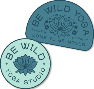
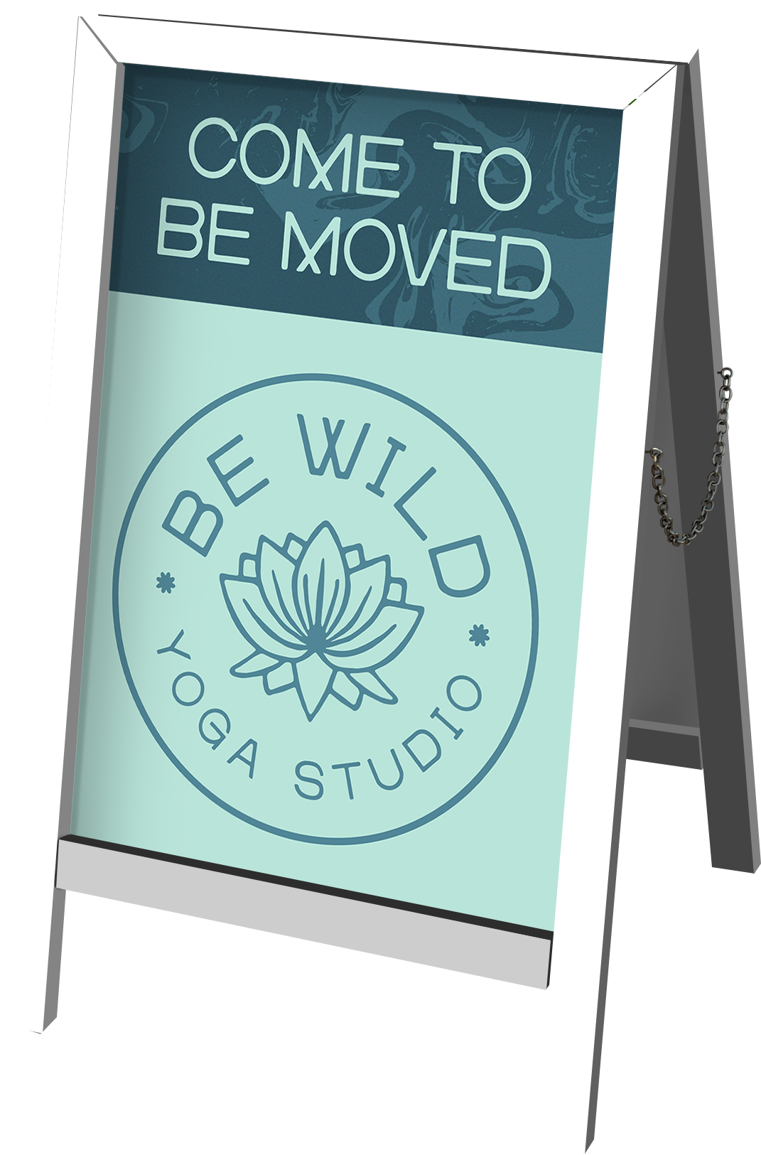
→ Logo System & Visual Identity
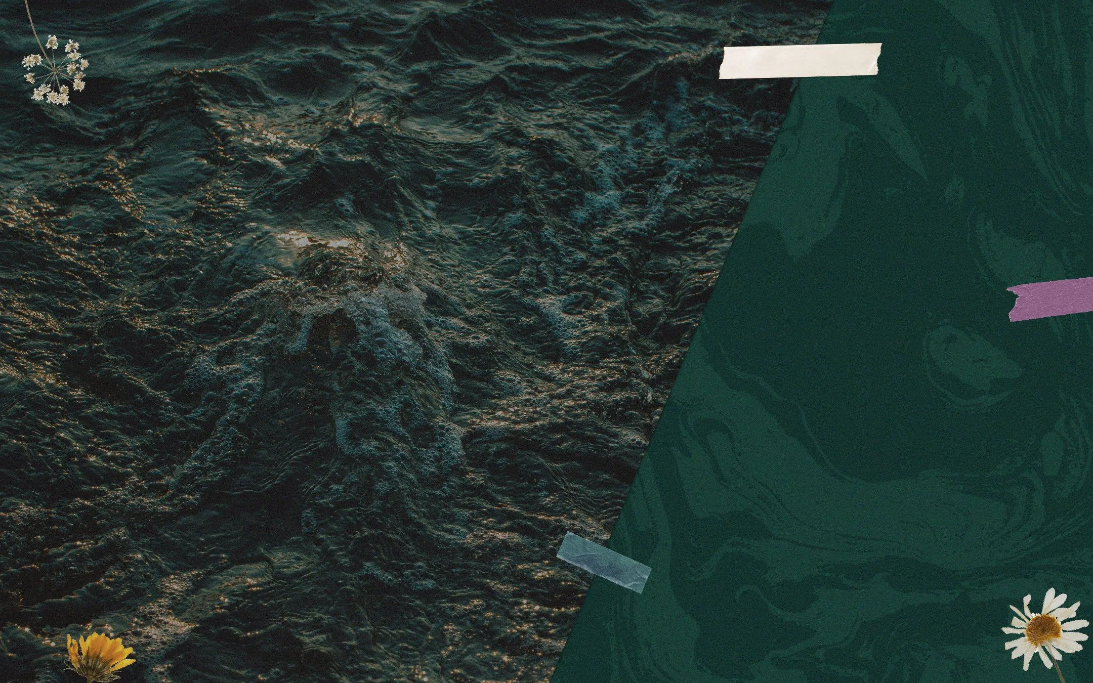
The logo system was designed to be organic and versatile — able to flex between full-wordmarks, icons, and hand-lettered scriptmarks. The primary logo incorporates soft, fluid lines and intentional asymmetry, symbolizing movement and emotional depth. The color palette took cues from nature — rich earth tones, soft neutrals, and sun-kissed warmth.
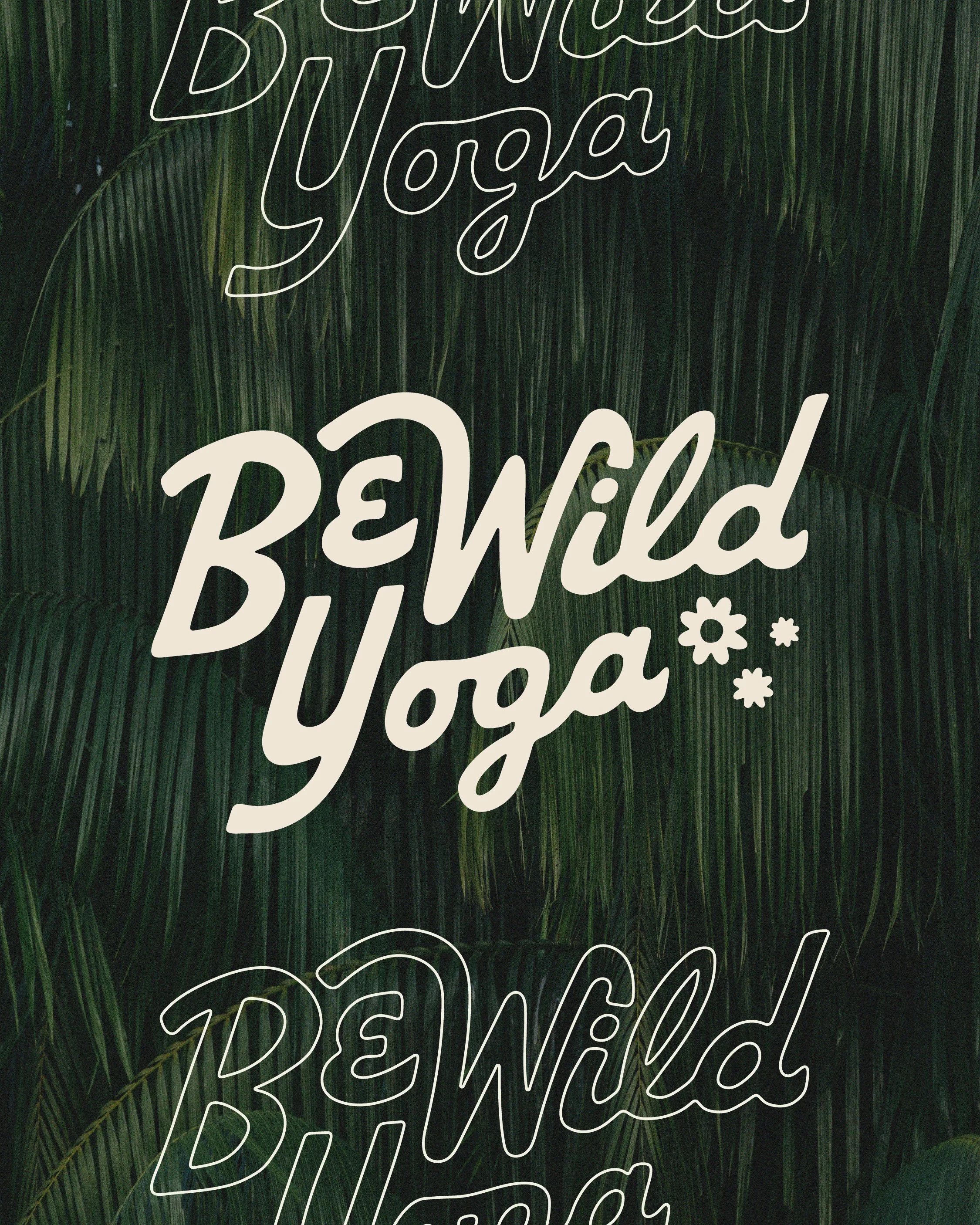
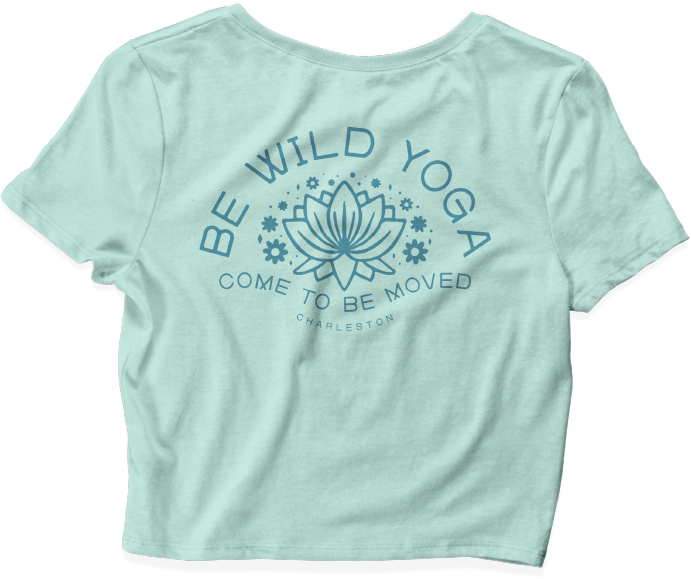
→ Custom Lettering
For the scriptmark, I created custom lettering to reflect the studio’s personal, hand-held approach. The result feels both delicate and bold — imperfect in all the right ways.
→ Typeface Design
I designed a custom font for the brand that adds a distinct, personal tone to every written touchpoint. It captures the wild, expressive spirit of the studio and helps unify all communication with a cohesive voice.
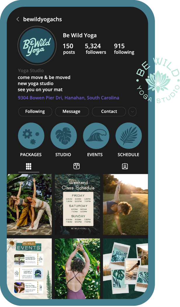
→ Brand Assets & Social Templates
I built out a flexible suite of social media templates and brand assets, designed to keep the studio’s content visually engaging and on-brand. These templates allow the team to show up consistently online while still maintaining room for spontaneity.
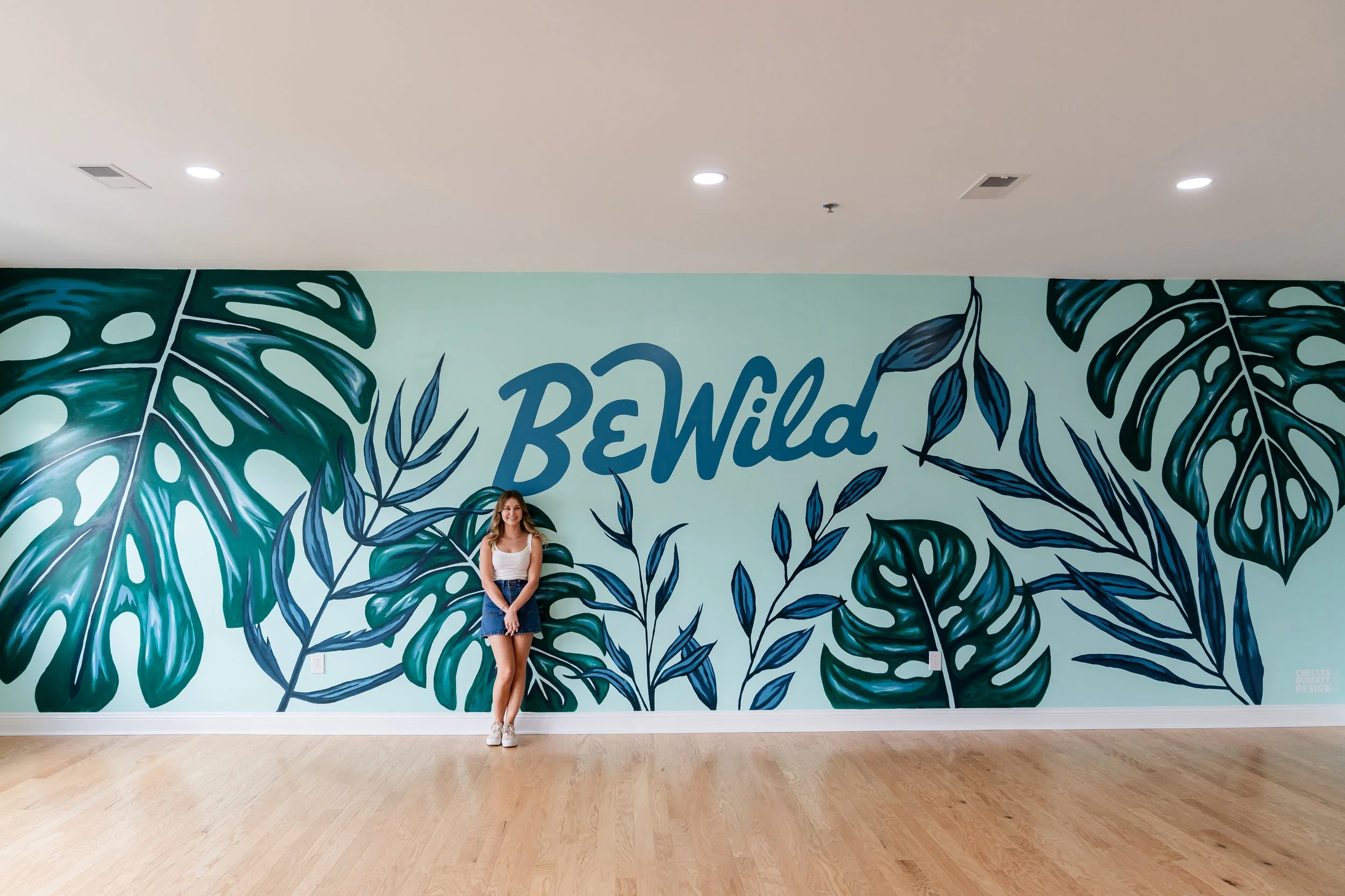
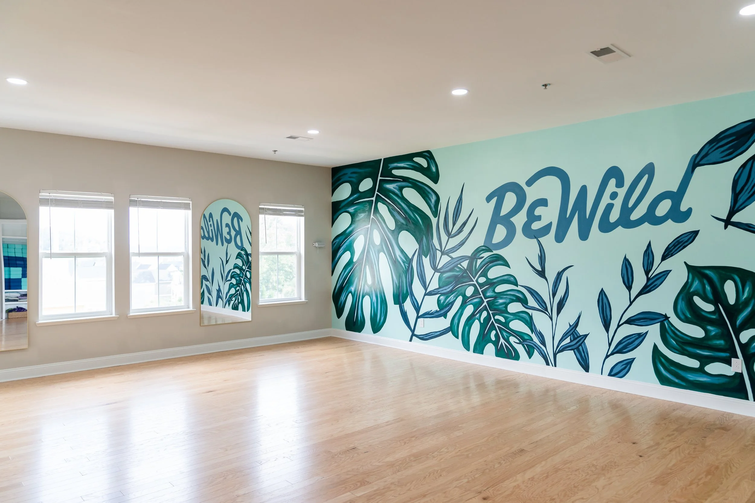
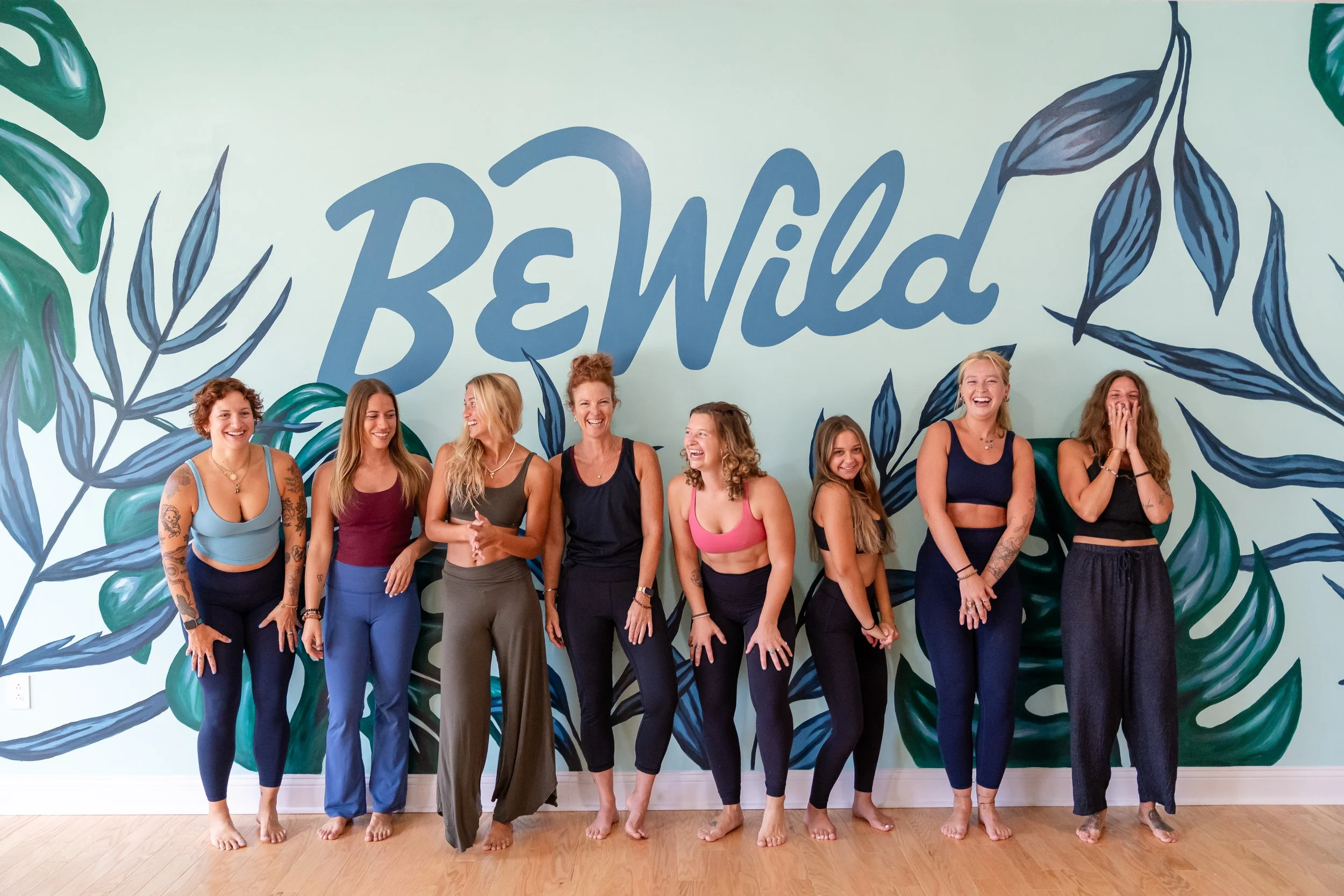
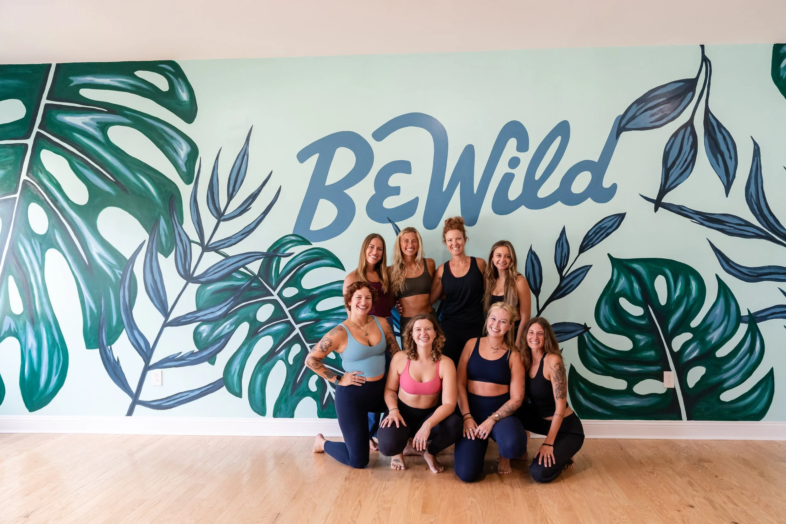
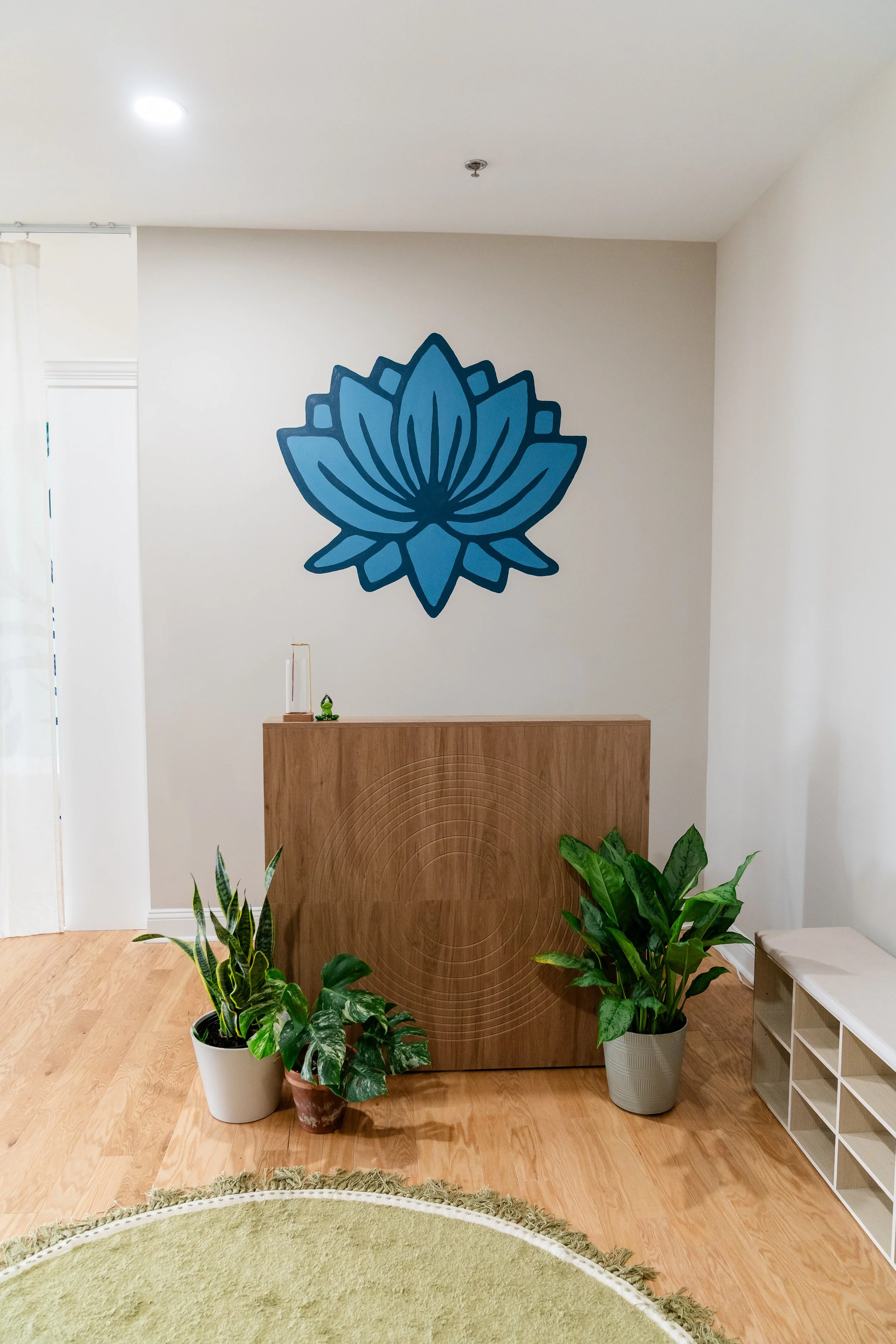
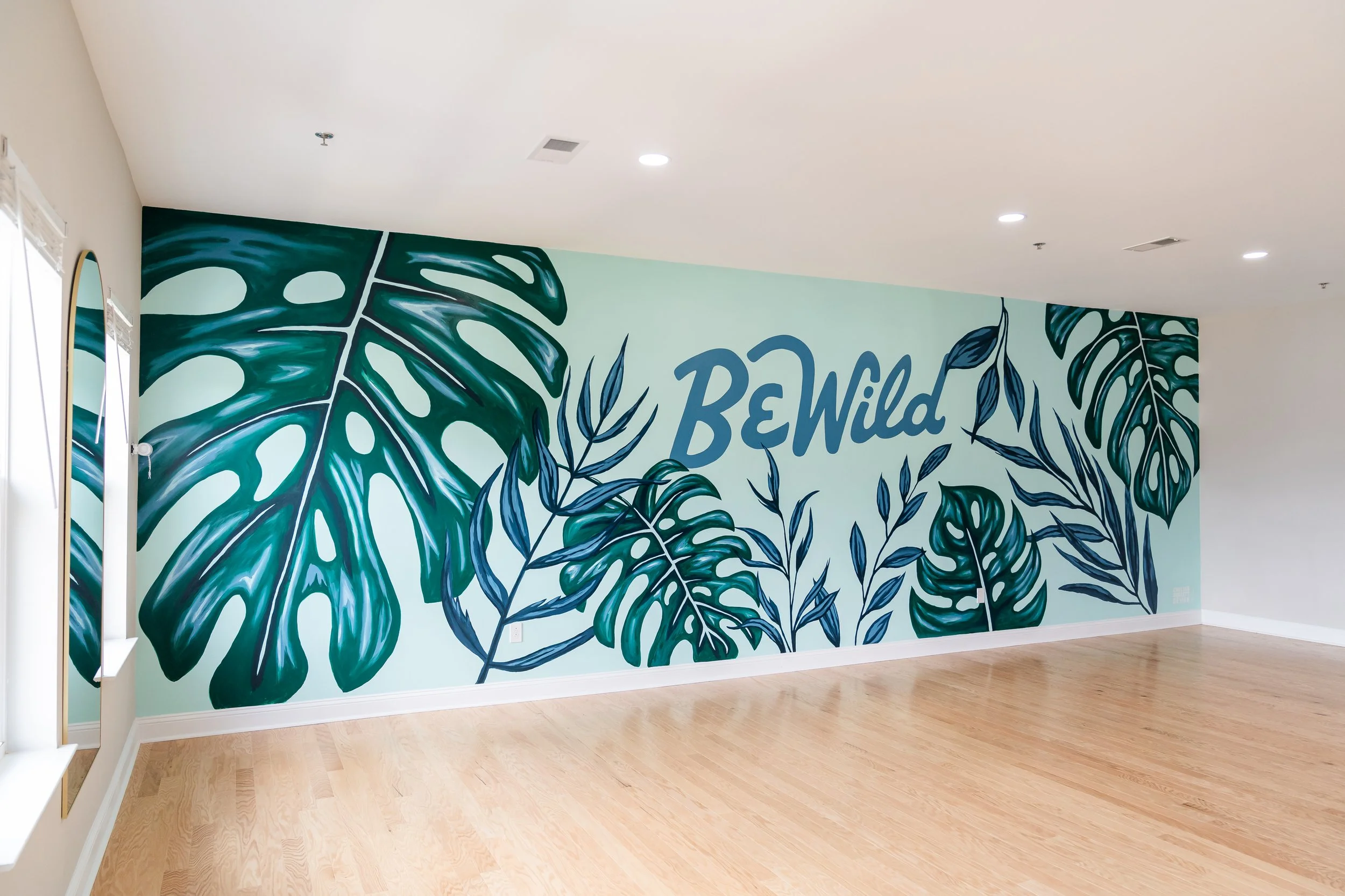
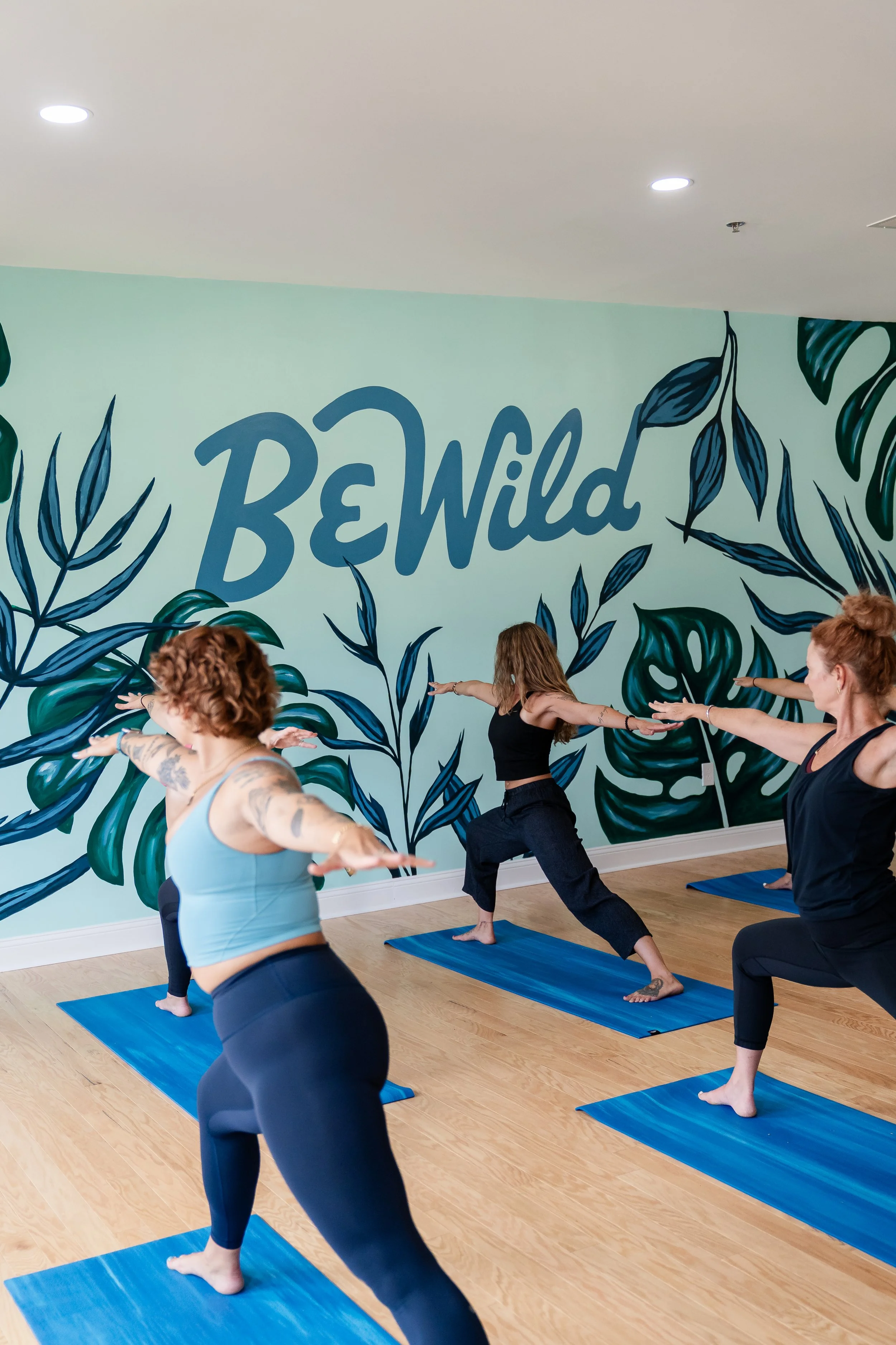
→ Environmental Design: Mural & Desk Mark
To bring the brand into the studio space, I designed and painted a large-scale mural that embodies the brand’s energy and message. I also hand-painted the brandmark at the front desk — a tactile detail that brings warmth and intentionality to the studio’s welcome point.
The Outcome
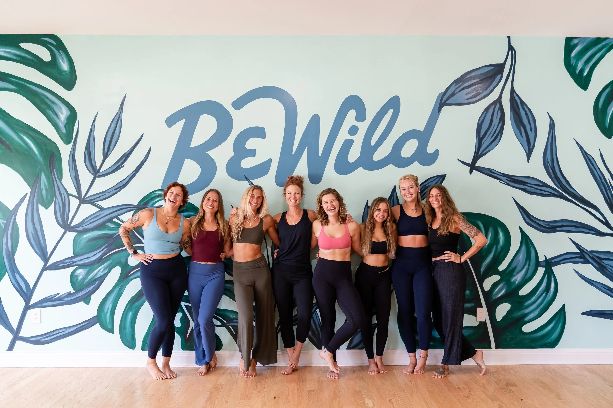
The final brand identity captures the heart of Be Wild Yoga: grounded yet spirited, imperfect yet intentional. It reflects the community they’ve cultivated — where playfulness meets healing, and vulnerability is met with strength.
The studio launched to an enthusiastic local audience, and the brand has helped shape a unique studio experience — one where every detail feels meaningful and aligned. The mural has become a photo-worthy focal point, and the hand-crafted elements serve as daily reminders of the studio’s mission.
Reflection
This project reminded me of the power of alignment between strategy and expression. Every choice — from the logo curves to the painted lettering — was rooted in meaning. It was a full-circle creative journey, and one of my favorite projects to date.